

Something a bit different, on the eve of the new Premier League season. I’m presuming at this point that you’ve all read my big team-by-team preview and are now patiently awaiting the Friday night countdown to the new season, as reigning champions Arsenal host newly-promoted Coventry City in what should be a very fun way to kick off the new campaign.
As summer transfer windows go, this has been relatively quiet. Maybe several dominoes are still waiting to fall post-World Cup, but when the majority of preview podcasts are casting their eye over the raft of new managers instead of the new players, you know we’re in a bit of bother.
One thing that has changed across the board are the kits, so without further ado — lets start with the five worst.
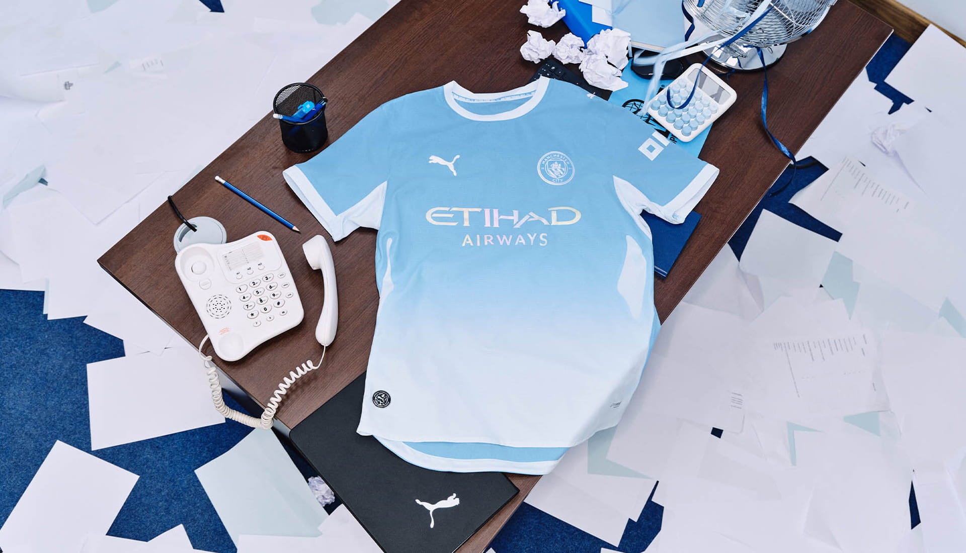
5. Manchester City (H)
Gradient kits are not for me, especially going from a light shade of blue to all white.
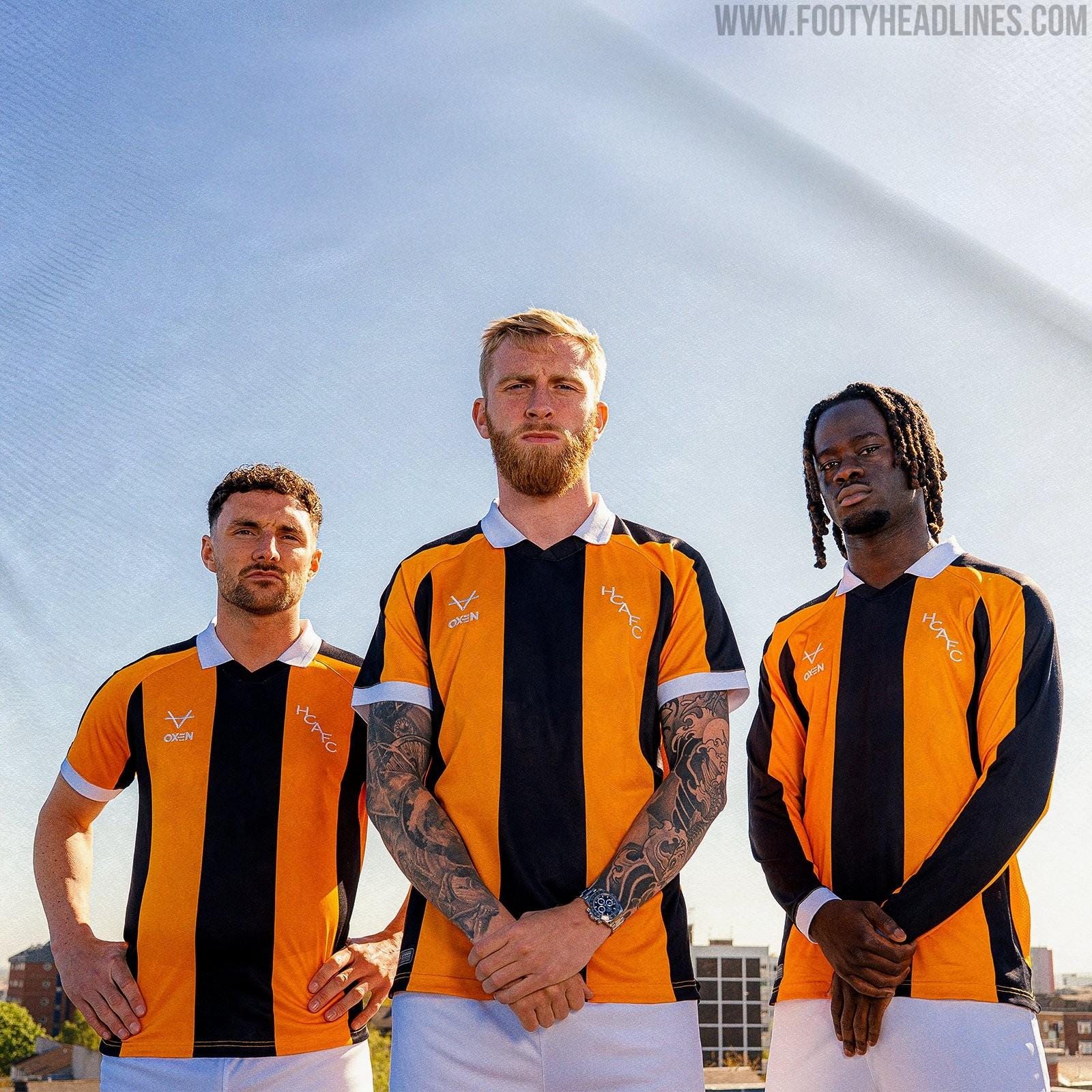
4. Hull City (H)
I like the concept of this throwback Hull shirt, but the deliver isn’t all there from *checks notes* Oxen?! It feels like it needs more stripes.
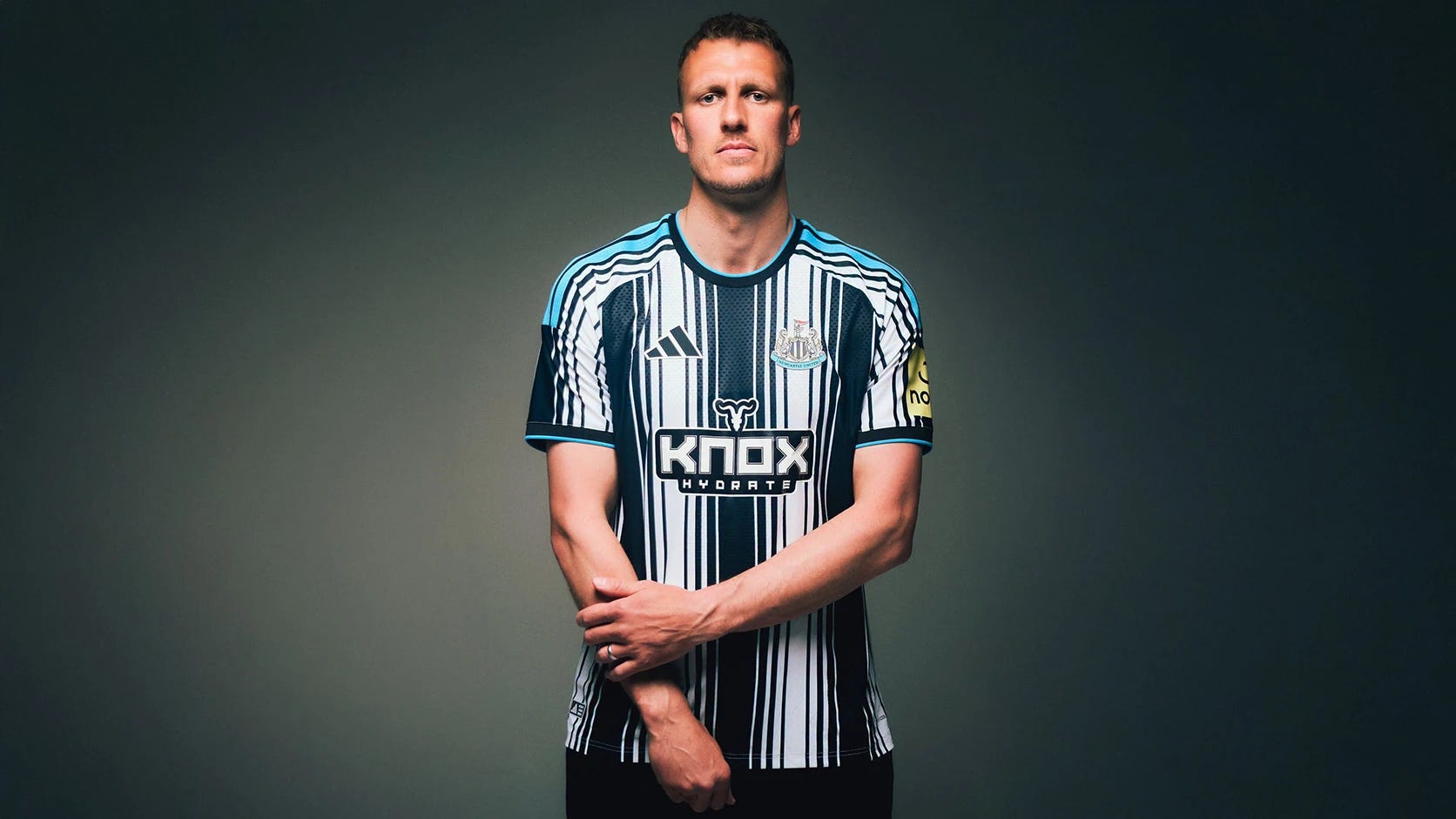
3. Newcastle (H)
Taking the Barcodes nickname to new heights with this effort. Yikes!
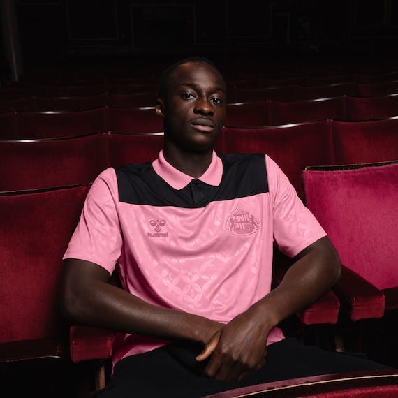
2. Sunderland (A)
Sorry, Sunderland, but this is truly awful. I’m an enjoyer of pink kits, give me a classic Palermo shirt any day of the week, and I adore shirts in this era of hyper-commercialisation that manage to go without a sponsor logo emblazoned on the front. Somehow, Hummel have whiffed on both here.
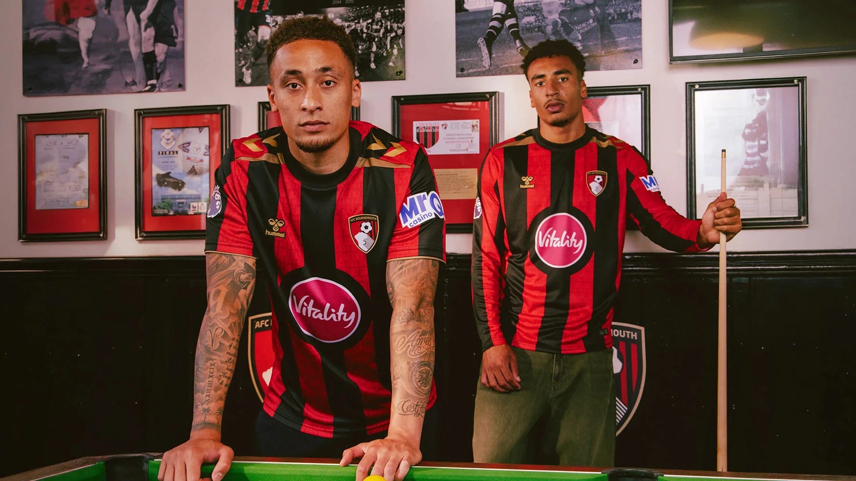
1. Bournemouth (H)
It’s the sponsor. An otherwise pretty nice shirt has been ruined by that circular button, making it look like a Pokéball that needs to thrown at an unsuspecting creature on a Gameboy Advance. And to make it worse, they didn’t even keep the same shade of red on the logo.
And the best…
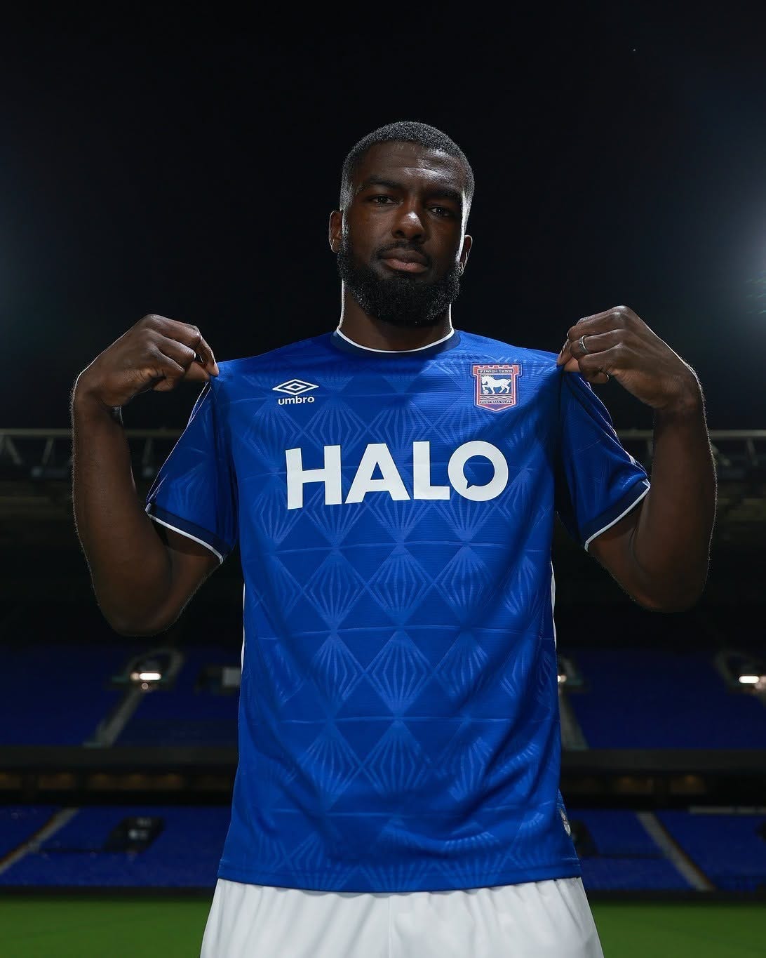
5. Ipswich Town (H)
It’s very easy to muck up a basic kit, and this has some very basic elements from Umbro, but they’ve delivered a beauty — the texture/design on the shirt adds a bit of nice detail, the logo, whilst big, isn’t too overbearing, and the collar brings it all nicely together. Top marks.
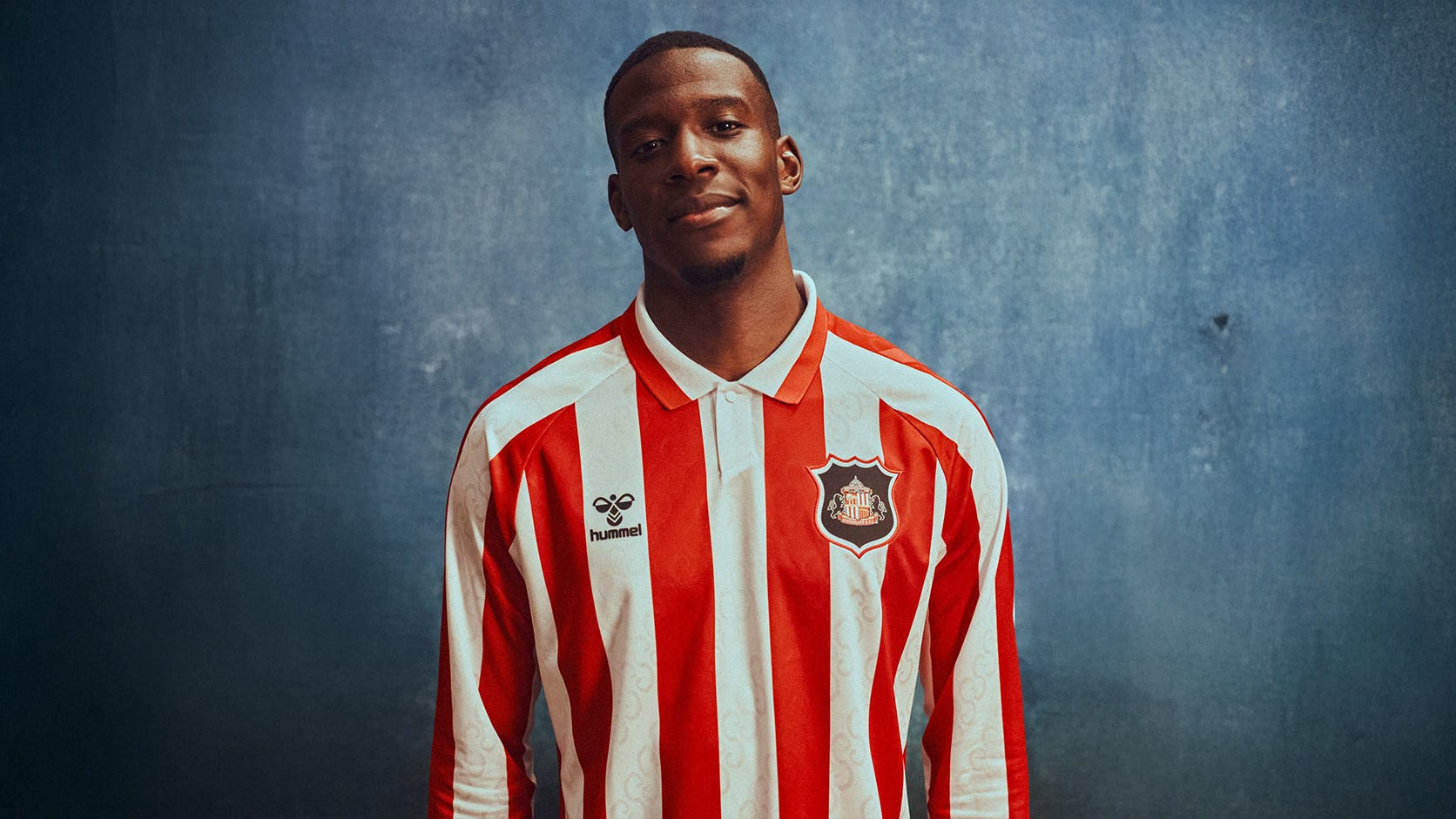
4. Sunderland (H)
Yes, Sunderland are in both ends of the list for the complete opposite reasons of the pink monstrosity — lovely collar, in fact one of the nicest I’ve seen in years, retro throwback, no sponsor, clean crest on the black shield — excellent all round.
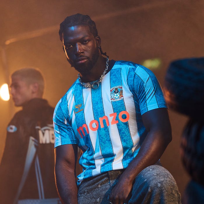
3. Coventry City (H)
The promoted teams are on a heater. Light blue and white stripes are a difficult combination to get right, but adding that detail to the blue stripes have really made this pop. Bonus points for coming back to the Premier League with this level of drip (I used that term correctly, right?).
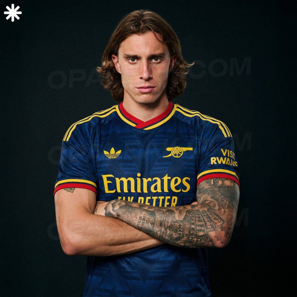
2. Arsenal (A)
This combination of away colours really works, for me. The dark navy is a fantastic canvas for the red and yellow to pop off massively. And I’m a sucker for the Trefoil Adidas logo.
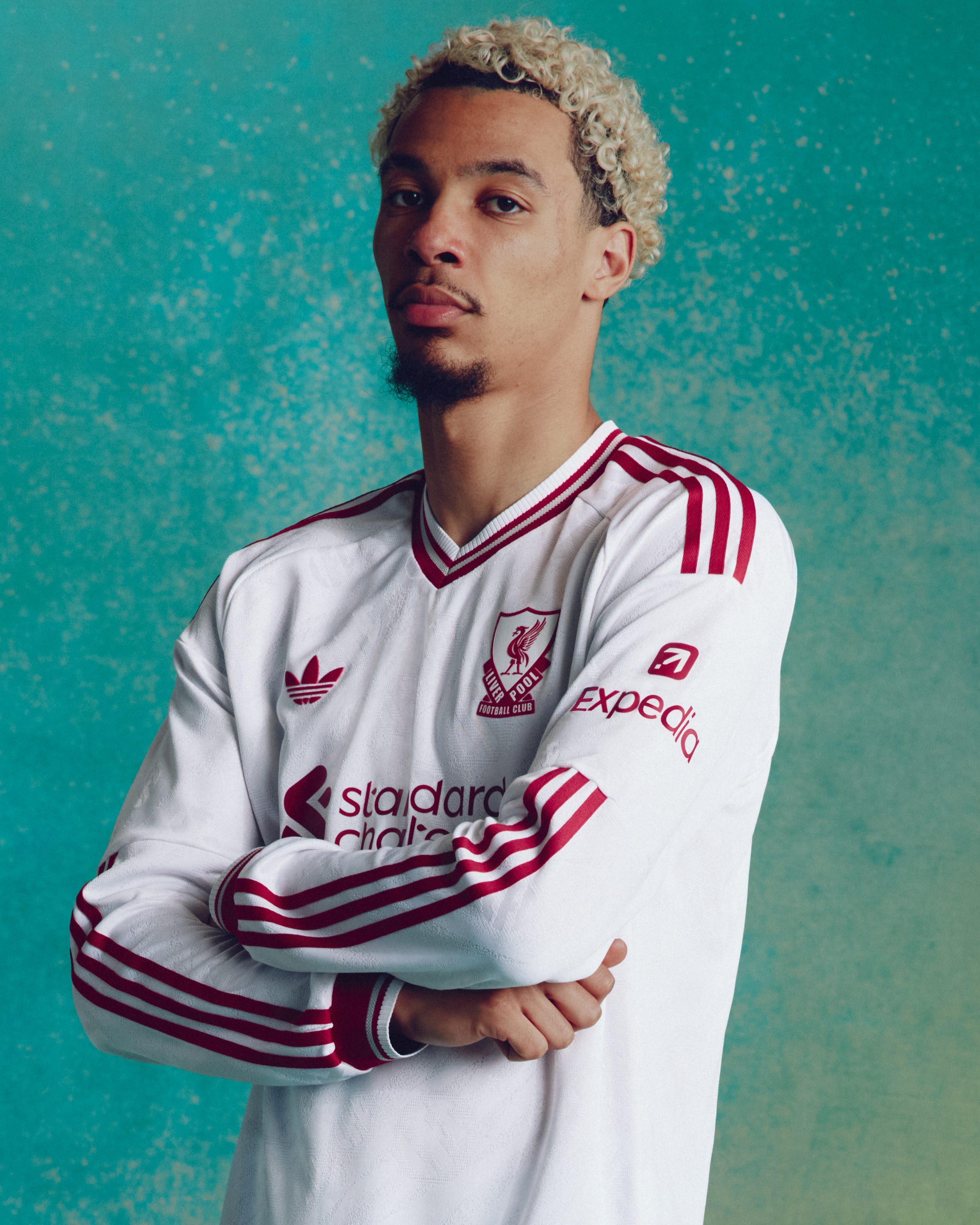
1. Liverpool (A)
I don’t think I’m being biased here putting Liverpool at number one, am I? White shirts are a dime a dozen and incredibly hard to make stand out, so taking elements from the 90s heyday with this number have turned into an instant classic. Seldom seen v-neck collar, Trefoil logo, all red on an all white shirt. I think this is as close to a perfect kit you’re going to see in this day and age.

The Forest away kit looks spot on in the flesh but the green doesn't come across so well in photos. Think the Leeds away and Arsenal away are the best two imo but do really rate Sunderland & Ipswich home kits plus yeah the Coventry home kit is pretty classy too.
I don't know how to feel about that Hull home shirt. I like it, but I also don't 😄